Client: Trivago
Branding, Identity, Graphic and Concept Development
(Speculative work — developed independently to explore a strategic brand challenge)
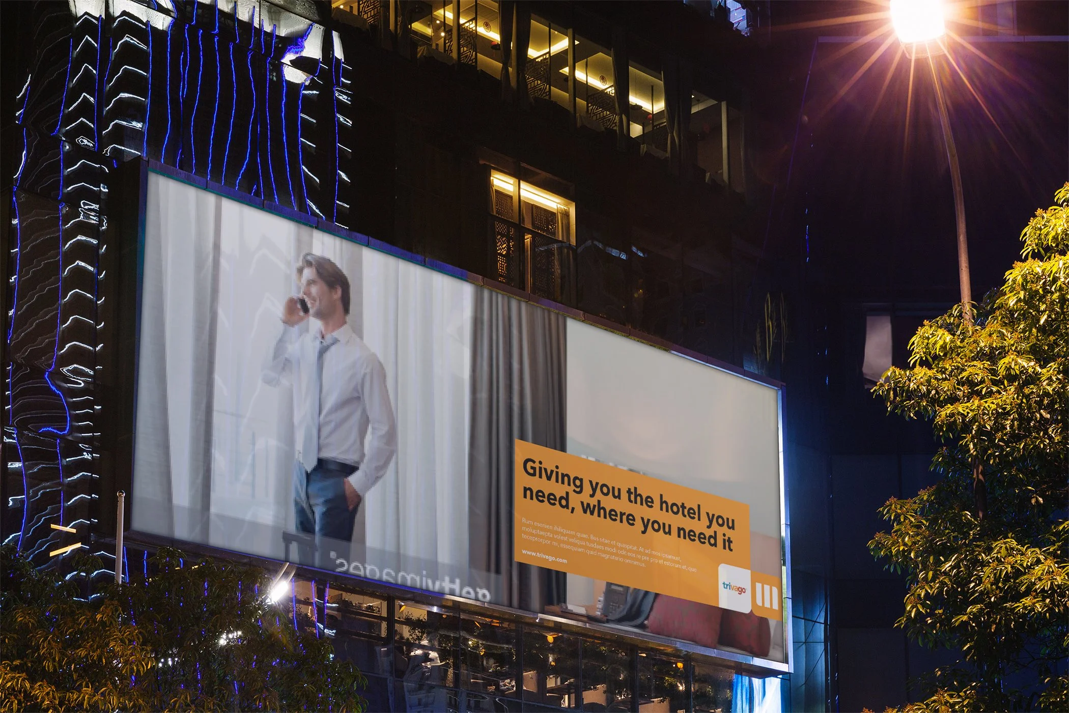
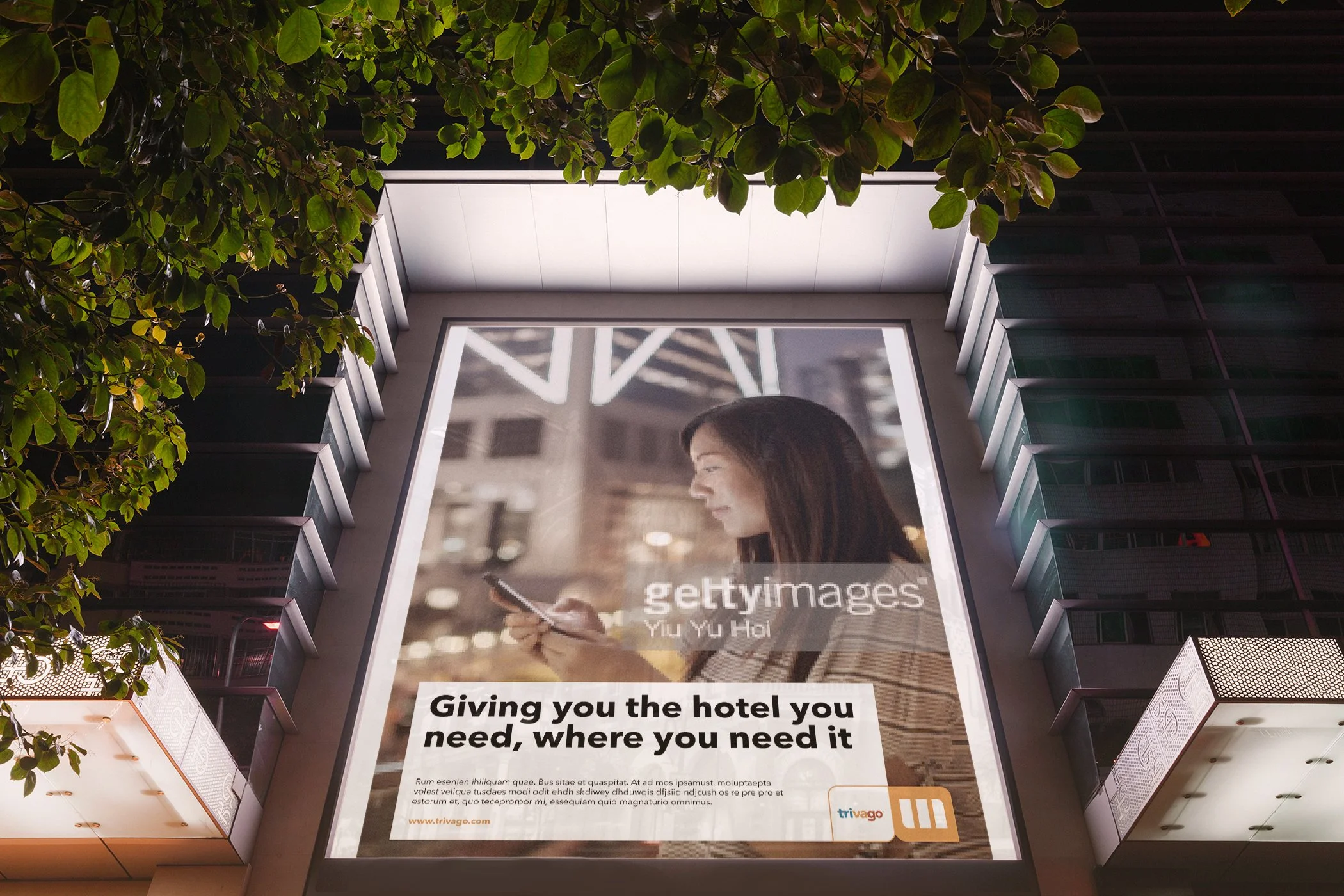
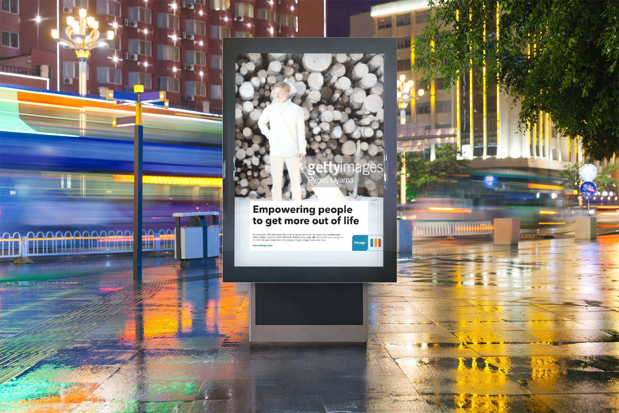
Trivago rebrand
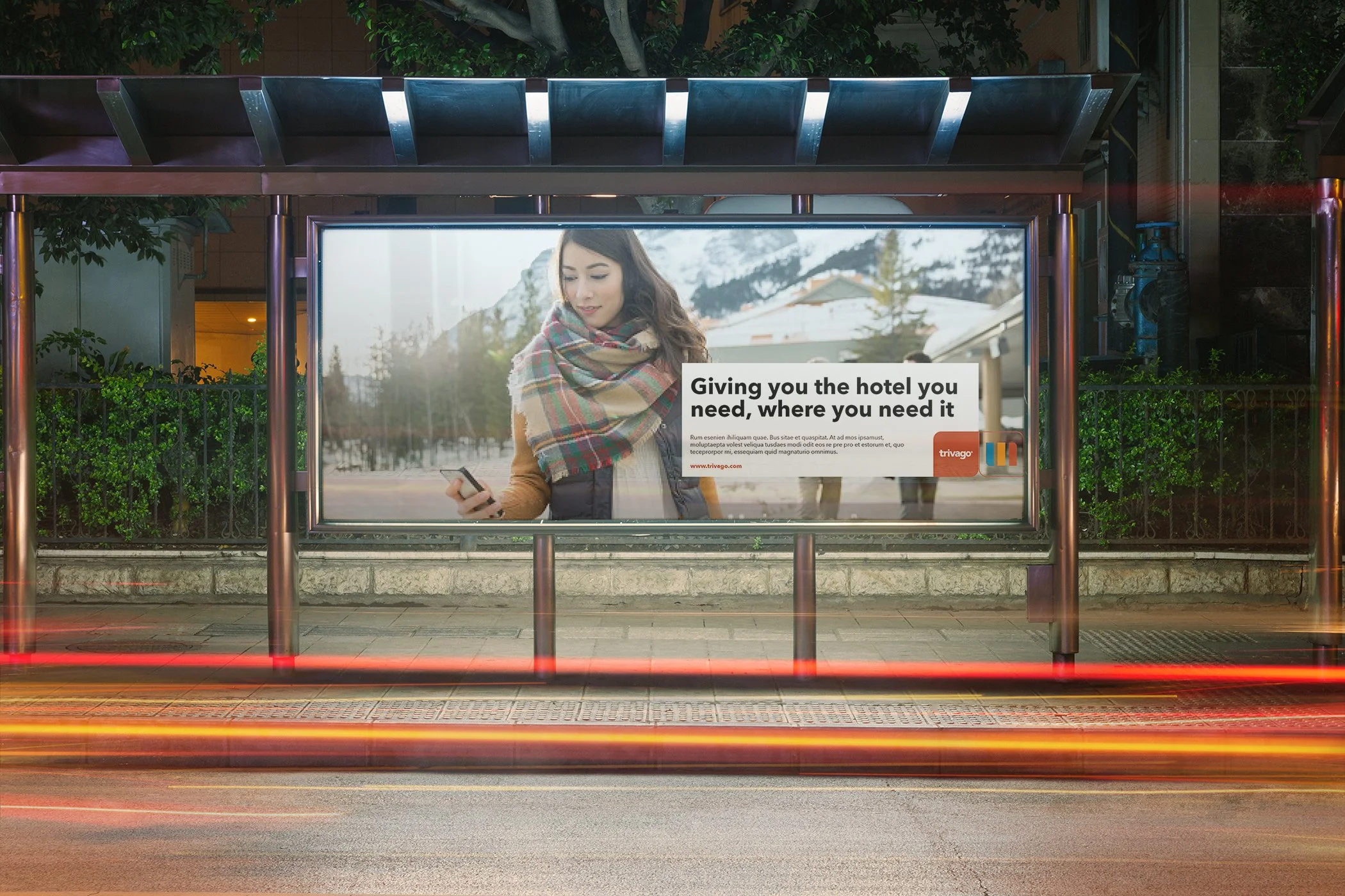
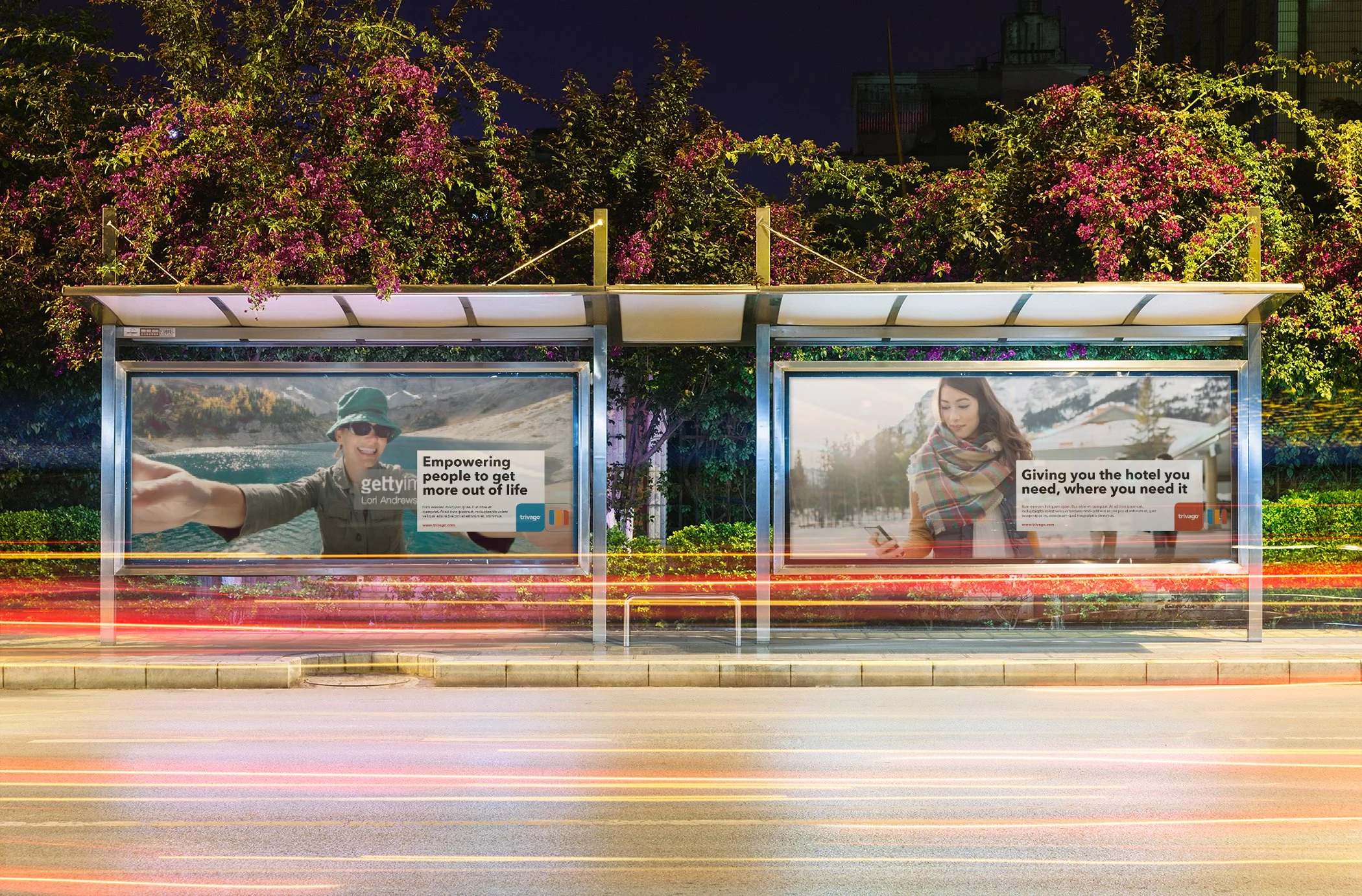
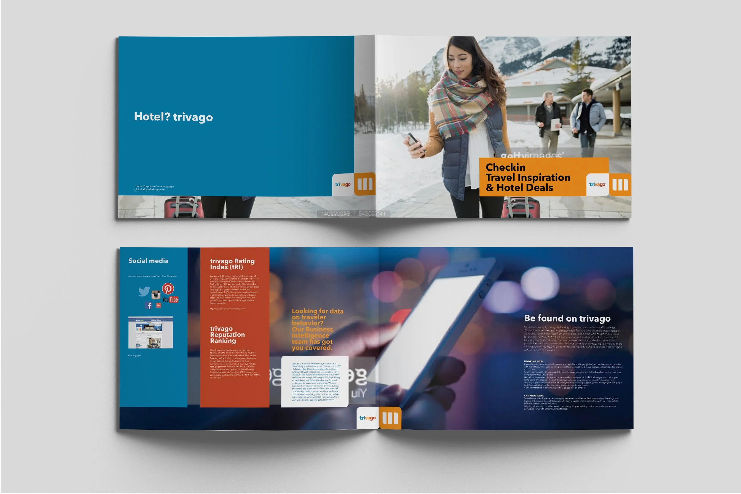
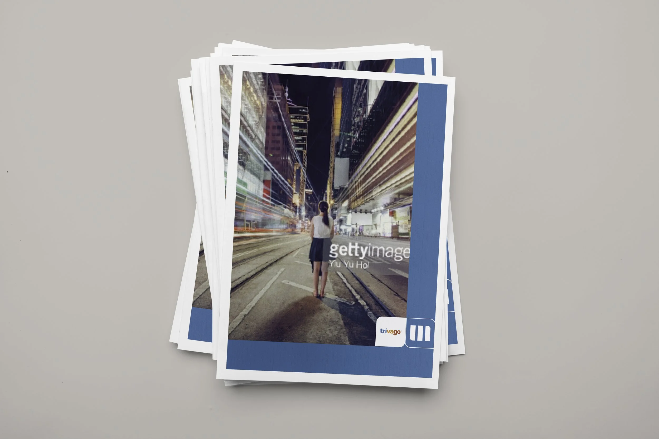
This project was developed as a case study challenge exploring how Trivago's brand identity could evolve beyond its consumer-facing positioning toward a more strategically coherent and visually distinctive corporate presence.
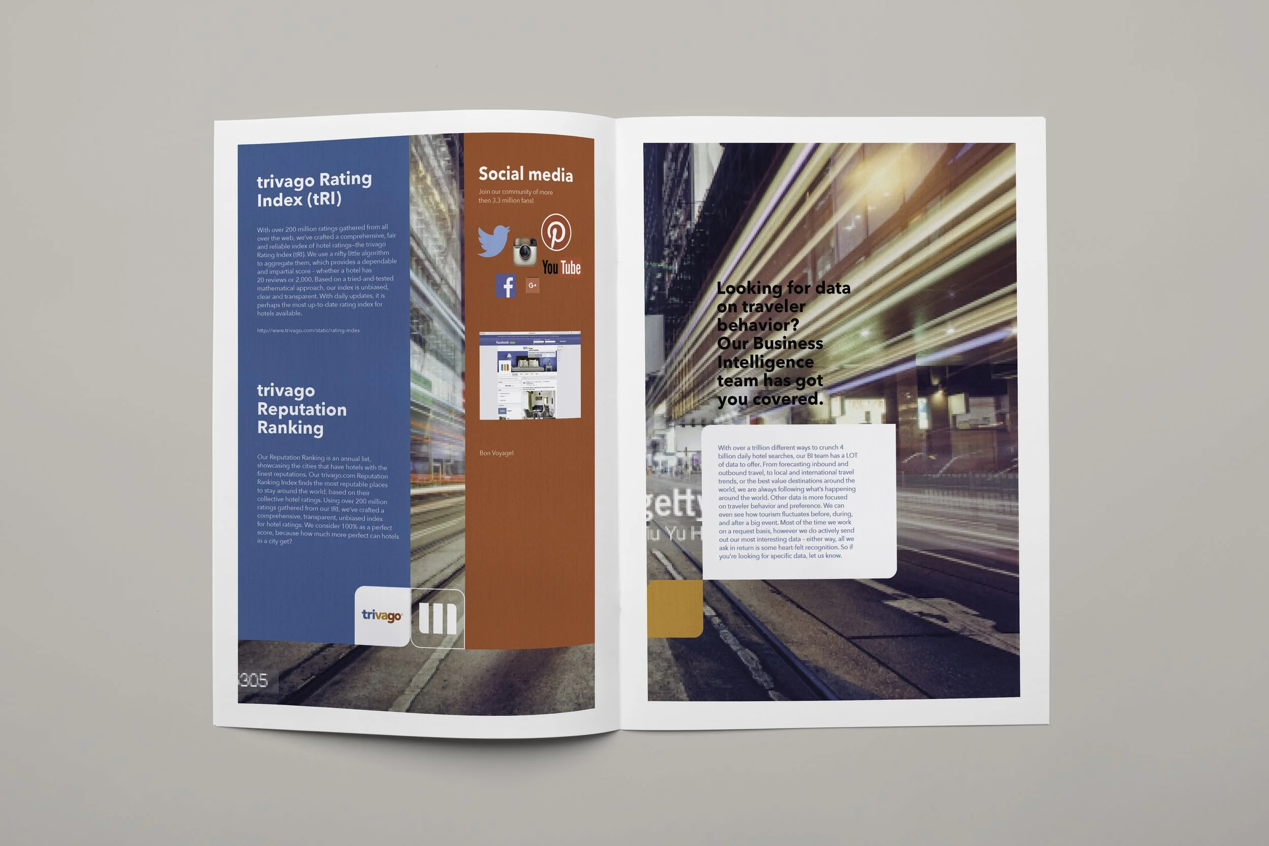
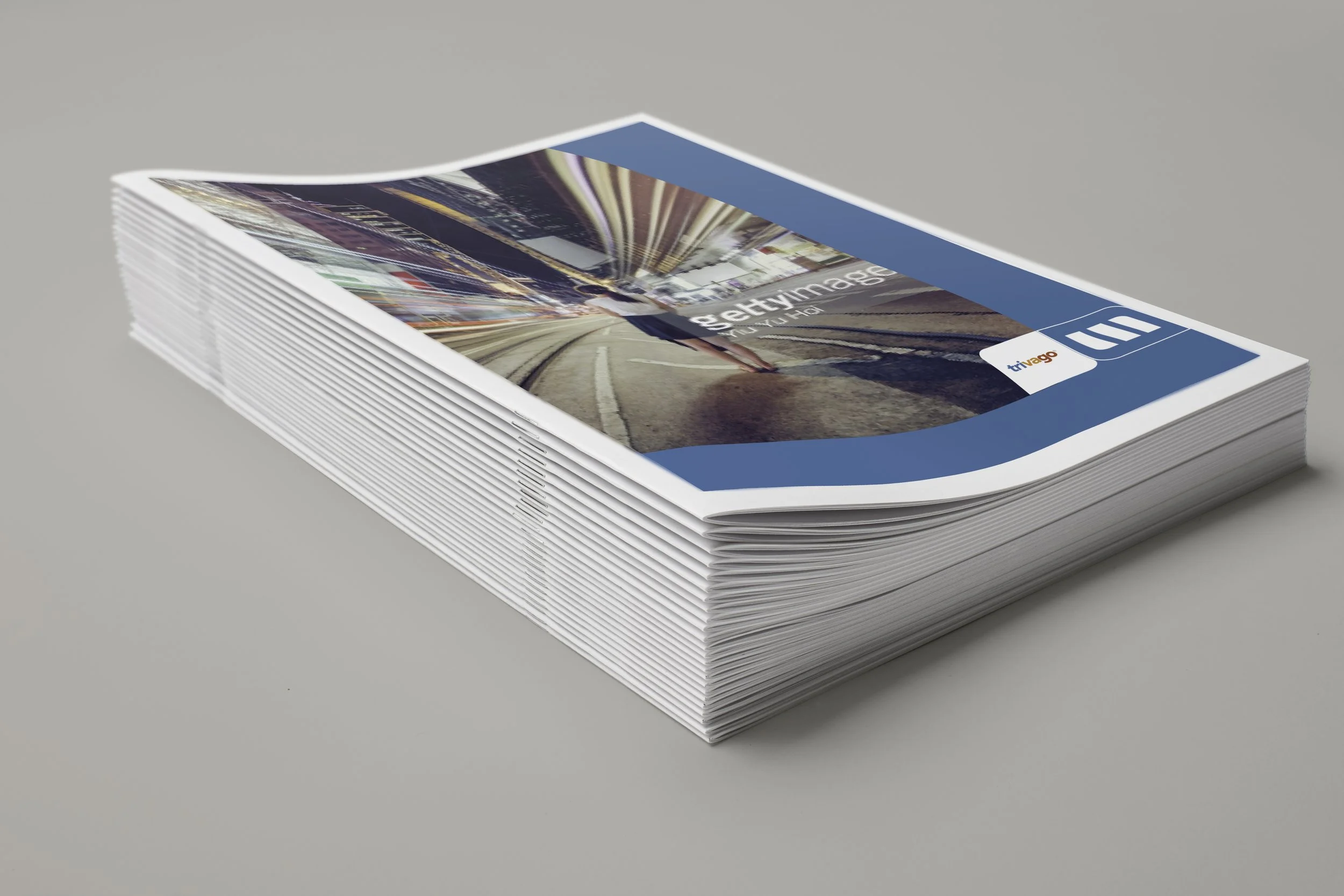
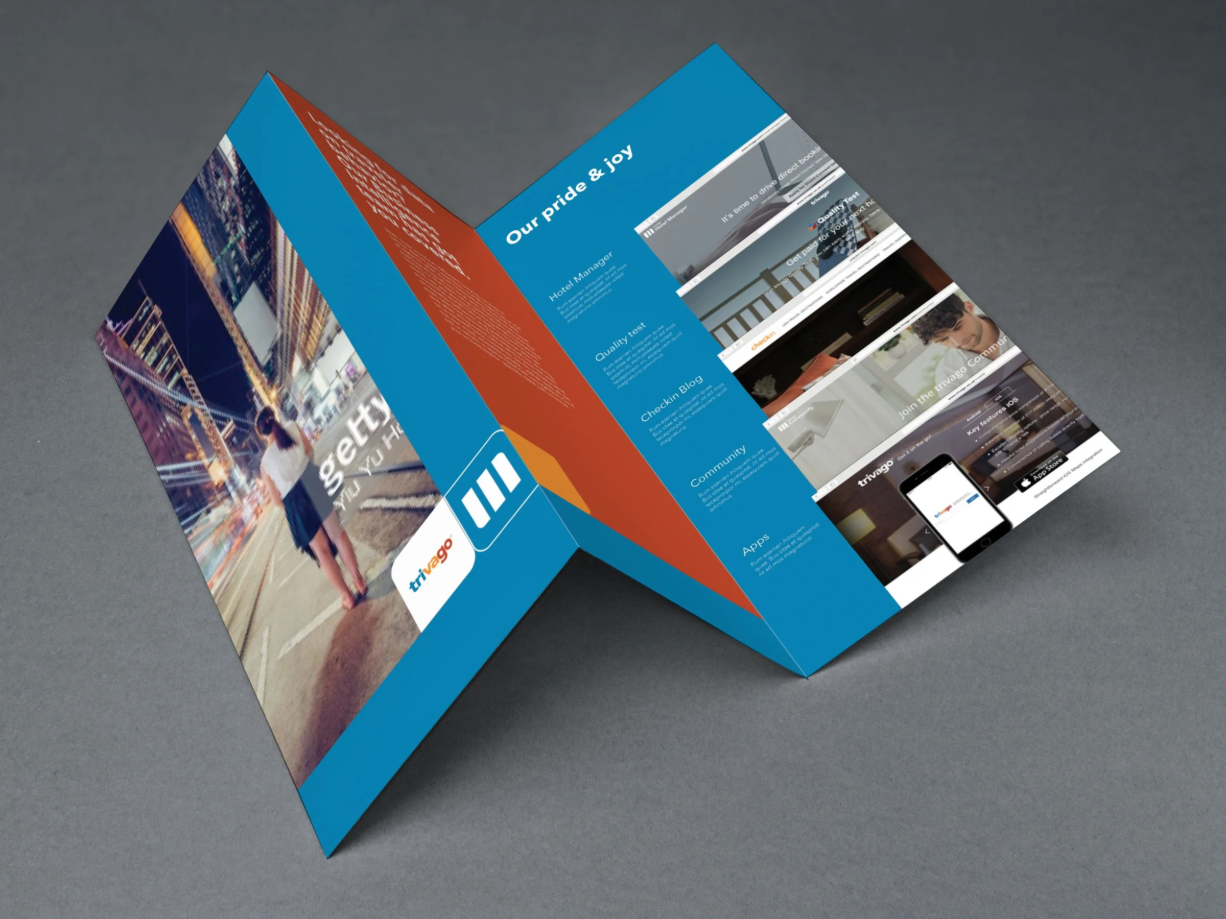
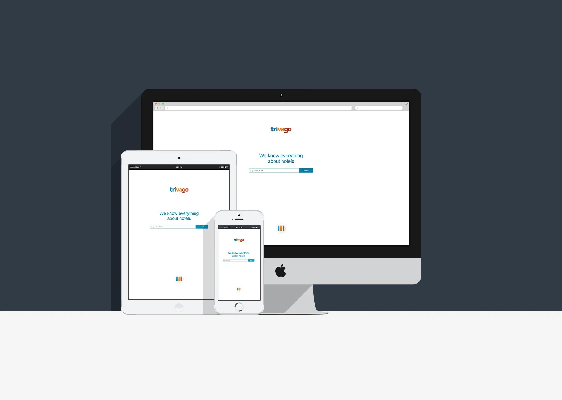
The starting point was an audit of the existing visual language: where it was working, where it was creating noise, and what a more considered system could look like. From there, I developed a flexible identity framework addressing visual hierarchy, typographic structure, and a refined color approach, built to scale consistently across communication touchpoints in both digital and print environments.
The objective was not a cosmetic refresh, but a repositioning of how the brand communicates authority and relevance in a competitive market. This work was conceived as a foundation for a potential corporate design roll-out strategy, outlining both the creative rationale and practical pathways for implementation. It reflects how brand evolution can be driven by purposeful decision-making and a clear understanding of where a visual system needs to go.