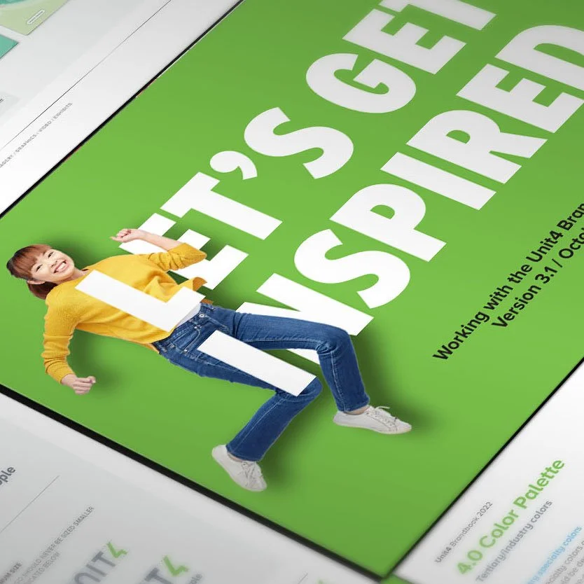
Branding, Identity, Graphic, Digital and Editorial Design, Creative Direction.
Client: Unit4
As Creative Manager, I was involved in shaping aspects of the brand direction and took a leading role in scaling and implementing the refreshed identity across the organization. My contributions helped ensure the brand was not only visually strong, but also practical, consistent, and adaptable in real-world use.
I collaborated with design and marketing teams during the early stages to help define visual and strategic elements of the rebrand. Following that, I led the development of a comprehensive set of branded templates—including presentation decks, internal documents, and marketing materials—designed to support consistent, on-brand communication across teams.
In parallel, I translated the core identity into a flexible, systemized framework that could scale across digital and print environments, while also supporting internal adoption through clear guidelines and tools.
This work helped bridge the gap between creative vision and practical execution—strengthening brand recognition, enabling team alignment, and setting the foundation for long-term scalability.
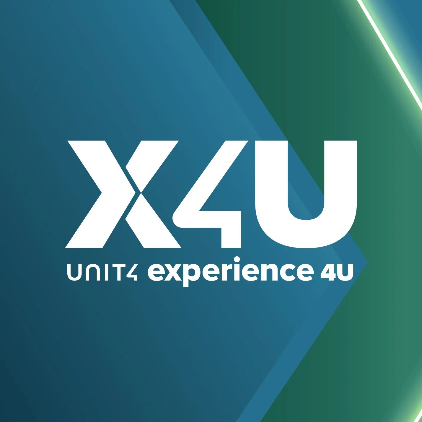
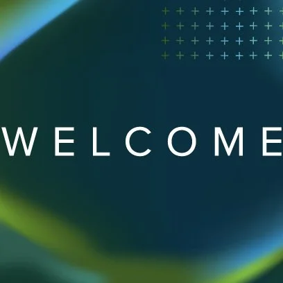
Branding, Identity, Graphic, Digital Design and Creative Direction.
Client: Unit4
This page showcases selected work from multiple editions of X4U, Unit4’s flagship customer event. Spanning several years, the event took place in both virtual and in-person formats, each requiring a tailored approach while maintaining a consistent brand identity.
The work covered a wide range of applications, including visual identity, digital platforms, presentations, motion graphics, signage, and promotional materials.
What’s shown here is just a sample of the extensive collateral created for each edition. The goal was to deliver a cohesive and engaging brand experience that reflected the evolving nature of the event while staying aligned with Unit4’s broader communication strategy.
Branding, Identity, Graphic, Digital Design and Creative Direction.
Client: Unit4
This page presents a curated selection of work developed for XKO, Unit4’s internal company-wide event series. Taking place over several years and in various international locations, each edition featured a unique theme and key visual, requiring a refreshed creative direction while staying rooted in a consistent brand framework.
The work included the design of visual identities, event branding, digital materials, signage, presentations, and environmental graphics, each adapted to fit the specific context, audience, and tone of the year.
What’s shown here represents only part of the broader set of collateral produced for each edition. The focus was on creating an energizing and cohesive visual experience that supported internal engagement, reflected the evolving culture of the company, and helped bring each event’s narrative to life.
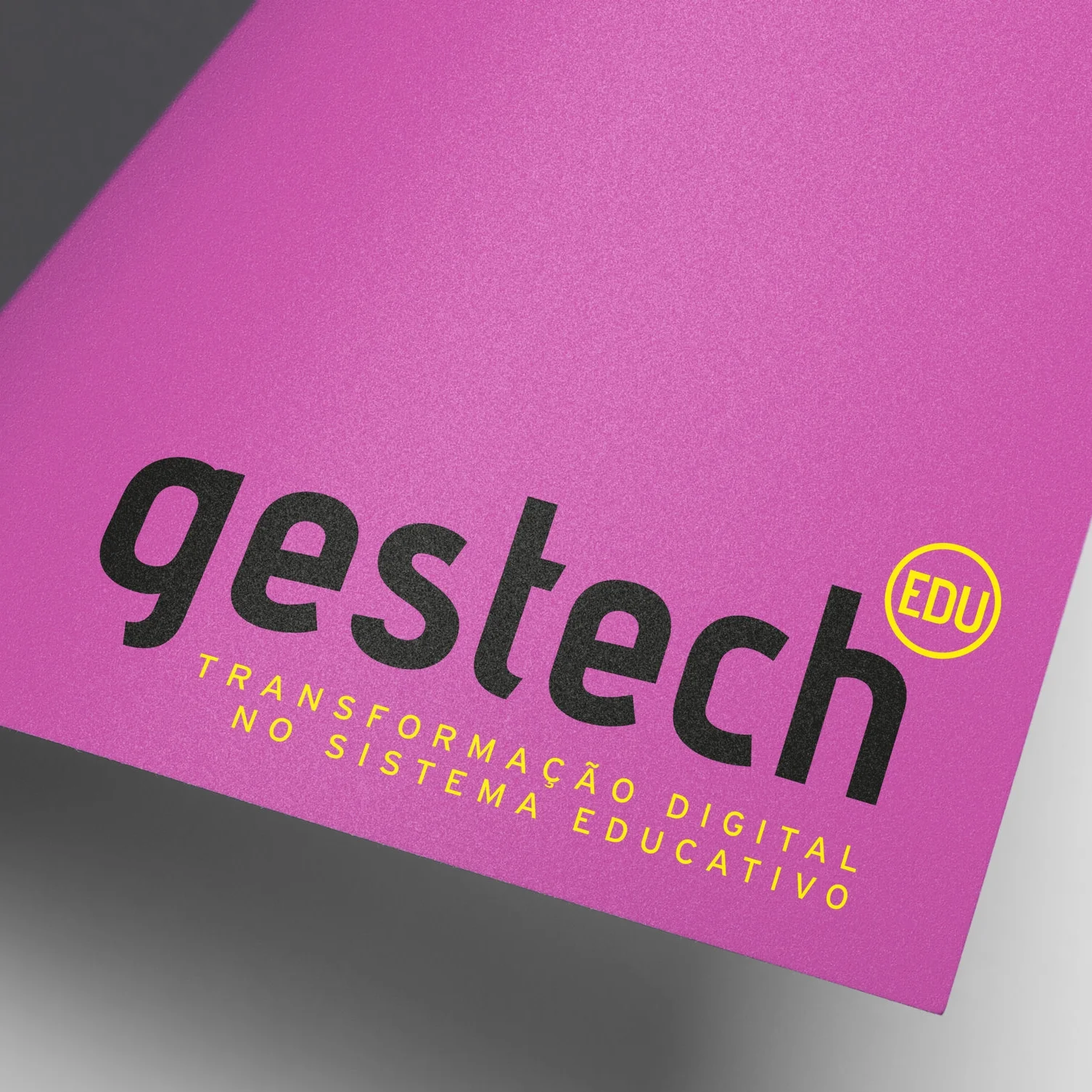
Branding, Identity and Graphic Design.
Client: IGeFE – Instituto de Gestão Financeira da Educação, I.P.
I created the visual identity for a government-affiliated event series focused on digital transformation within the national education system. The initiative explored the role of technology in education, its current applications, its long-term impact, and the opportunities it presents for institutional innovation.
The brief called for a forward-looking identity that could communicate the complexity of the subject while remaining accessible and engaging for a diverse audience, including educators, policymakers, and IT professionals.
My approach was to build a flexible visual language that reflected both the systemic nature of digital integration and the human dimension of educational progress. I developed a modular design system—including logo, typography, color palette, iconography, and layout principles—designed to work seamlessly across event collateral such as programs, signage, digital assets, and presentations.
The result was an identity that positioned the event as a credible, future-oriented platform while enabling clarity, consistency, and recognition across multiple editions and formats. It helped establish a professional, cohesive presence and reinforced the event’s role as a driver of dialogue and change within the education sector.
Branding, Identity, Graphic and Concept Development
Client: Trivago (Case Study)
This project was developed as a case study challenge to define a future-facing brand identity concept for Trivago. The objective was to explore how the brand could evolve from its existing positioning toward a more strategically aligned and emotionally resonant corporate identity.
The brief called for a conceptual framework that could shape the look and feel of Trivago’s corporate design in the coming years—balancing strategic foresight with creative expression. This involved identifying key brand attributes, assessing the current visual language, and proposing a direction that would both differentiate and scale across communication touchpoints.
My approach centered on designing a flexible identity system that could evoke emotional connection while remaining functional across both digital and traditional channels. The concept would address tone of voice, visual hierarchy, and sensory triggers, and aimed to build brand affinity through consistency, clarity, and relatability.
This work would serve as the foundation for a potential corporate design roll-out strategy, outlining both the creative rationale and practical pathways for implementation. It demonstrated how brand evolution can be driven by purposeful storytelling and human-centered design thinking.
Branding, Identity, Graphic and Editorial Design, Creative Direction.
Client: Unit4
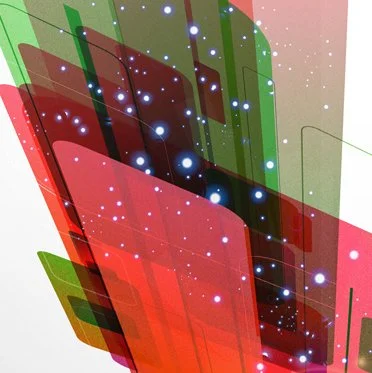
‘Crazy Lab Days’ is an internal innovation event hosted by Unit4 Business Software, designed to foster creativity and cross-functional collaboration. It provides employees with the opportunity to step beyond their day-to-day responsibilities, explore new ideas, and develop innovative solutions for the company's products and services.
Held annually, the event encourages experimentation in a dynamic, problem-solving environment, often culminating in the presentation of working prototypes and a friendly competition to recognize standout contributions.
Since 2020, each edition of Crazy Lab Days has featured a unique visual identity, unified under an overarching space exploration theme with evolving design variations.
A variety of creative assets are produced for the event, including a key visual, digital banners, print materials, and a presentation template deck.
Branding, Identity and Graphic Design
Client: ENSA - Seguros de Angola (proposal)
This project was a full rebranding proposal for ENSA, one of Angola’s leading insurance companies. The objective was to modernize the brand while preserving key elements of its legacy, most notably the star symbol, a recognizable feature of the original logo and a mandatory component in the new identity.
The challenge was to evolve ENSA’s visual presence into a contemporary, trustworthy, and forward-looking brand that would reflect its role as a national institution while positioning it competitively within the regional and global insurance landscape.
The proposal included a redesigned logo and a comprehensive visual system applied across all communication platforms, from corporate stationery and digital assets to branch signage, media, and head office branding. The star was reinterpreted to convey clarity, stability, and aspiration—serving as both a visual anchor and a narrative link to the company’s history.
This rebrand aimed to deliver not only a refreshed visual identity but also a unified and scalable communication system, one capable of supporting ENSA’s growth, strengthening brand recognition, and aligning internal and external messaging across all channels.
Graphic and Editorial Design, Creative Direction.
Client: UANDA for the Angolan Embassy in Madrid, Spain
Angola: una trayectoria de cuatro décadas is a commemorative book marking the 40th anniversary of Angola’s independence. The publication offers a visual and narrative journey through the country’s transformation, from its post-independence landscape in 1976 to the social, political, and cultural developments that followed.
I led the creative direction, graphic, and editorial design of the book, shaping a cohesive visual narrative that balanced archival imagery, contemporary photography, and written testimonies from key Angolan figures and institutions.
The design approach aimed to honor the gravity of the historical subject matter while offering a clear and engaging reading experience. Through careful typographic choices, image treatment, and layout composition, the book creates space for reflection while guiding the reader through four decades of national identity and progress.
The result was a publication that served not only as a commemorative artifact but also as a tool for cultural diplomacy, offering international audiences a thoughtful and visually rich perspective on Angola’s history, growth, and resilience.
Branding, Identity and Graphic Design.
Client: Montepio Geral – Associação Mutualista
Montepio launched a nationwide study among its 10,000+ associates to identify health-related behaviors and potential risk factors across different life stages. The initiative required a clear, approachable identity to support communication with both participants and healthcare partners.
I was responsible for developing the brand identity, naming, and a comprehensive set of printed materials, including questionnaires, consent forms, vouchers, envelopes, and partner listings, designed for distribution across both individual and institutional touchpoints.
The name Pro.Mo was developed as a hybrid of Promoção (health promotion) and Montepio, encapsulating the initiative’s dual focus on prevention and community care. It was accompanied by the signature: “Better understanding for better caring”, reinforcing the study’s purpose and tone.
To ensure relevance across different target groups, the identity was expanded into three sub-brands corresponding to key stages of child development—baby, child, and teenager—each with its own tailored visual variation while remaining within the core identity system.
The result was a cohesive and flexible branding solution that helped increase clarity, trust, and engagement among participants, while supporting Montepio’s broader mission of mutual care and well-being.
Branding, Graphic and Editorial Design, Creative Direction.
Client: IEFP – Instituto do Emprego e Formação Profissional
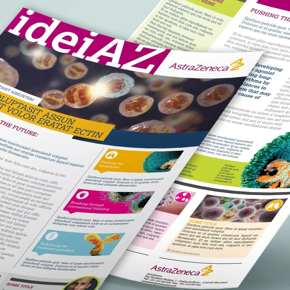
D&F (Dirigir & Formar) is the official magazine of IEFP, Portugal’s national public employment service. As the institute’s main editorial platform, the publication plays a key role in shaping institutional visibility and communicating with a broad national audience.
I was responsible for the design and ongoing development of the magazine’s visual identity, ensuring it reflected the authority of the institution while remaining contemporary, engaging, and reader-friendly. The goal was to create a publication that could confidently carry institutional weight while still being accessible to professionals across diverse fields.
Working within a defined editorial structure, I established a clean and adaptable layout system to support long-form content, interviews, opinion pieces, and data-driven insights. I focused on clarity, hierarchy, and rhythm, balancing typographic precision with thoughtful visual pacing across issues.
The result was a refined yet practical editorial design framework that elevated the magazine’s presence, reinforced IEFP’s positioning, and supported the delivery of clear, consistent, and credible content at a national level.
Branding, Identity and Graphic Design.
Client: IGeFE – Instituto de Gestão Financeira da Educação, I.P. ( Ministry of Education
I developed the visual identity for a national awareness campaign commissioned by the Ministry for Education, aimed at informing citizens about a new initiative providing free books to children from early years through middle school.
Working closely with key stakeholders, I translated the program’s mission into a clear, approachable, and inclusive visual system. The goal was to create a design language that resonated with a broad audience (parents, educators, and the general public), while remaining aligned with institutional values and accessibility standards.
The identity was built to be both engaging and functional, balancing a warm, child-friendly tone with the credibility expected of a government-led campaign. I designed a suite of adaptable graphic assets and communication materials, including campaign posters, brochures, and social media visuals—ensuring cohesive and consistent messaging across all touchpoints.
This work helped elevate the visibility of the program, clarified its purpose to diverse audiences, and supported the Ministry’s efforts to build trust, awareness, and long-term engagement around the initiative.
Branding, Identity, Graphic and Editorial Design, Creative Direction.
Client: CCMP – Mozambique-Portugal Chamber of Commerce
MOZ’IN is a bilingual magazine developed by the Mozambique-Portugal Chamber of Commerce to strengthen ties between the two countries. Designed as a platform for cultural, economic, and institutional exchange, the publication offers curated insights into bilateral cooperation, investment opportunities, and shared development.
I was responsible for the magazine’s brand identity, design, and overall creative direction. The goal was to create a professional yet approachable publication that could serve as both an informative resource and a strategic communication tool for the Chamber.
The identity was designed to reflect the dynamic relationship between Mozambique and Portugal, balancing editorial clarity with a visual language that conveyed openness, reliability, and international relevance. Layouts were developed to accommodate diverse content types: from interviews and data reports to cultural features, while maintaining consistency and readability.
The result was a cohesive and versatile publication that positioned MOZ’IN as a trusted voice in the bilateral landscape, enhancing the Chamber’s visibility and strengthening its role as a connector between institutions, businesses, and communities.
Graphic and Editorial Design, Creative Direction.
Client: Partnership between Administração Tributária Geral de Angola (General Tax Authority Angola) and beCOMM
With an ever evolving and changing market conditions in Angola, this Guide for Imports was created to better inform and help investing companies into the key legal aspects and customs procedures in the country.
Editorial and Graphic Design
Client: BISTP – São Tomé and Príncipe International Bank
I was responsible for the design of BISTP’s Annual Report, a key publication that communicates the bank’s financial performance, strategic developments, and institutional positioning to stakeholders, investors, and regulatory bodies.
The objective was to create a clear, structured, and visually coherent document that balanced regulatory precision with brand presence. Working within strict content and compliance parameters, I developed an editorial layout that prioritized readability, hierarchy, and data visualization—ensuring complex information was presented in an accessible and engaging format.
The design emphasized clarity through refined typography, thoughtful spacing, and a consistent visual rhythm across sections. Tables, charts, and infographics were crafted to enhance understanding without compromising the report’s formal tone.
The result was a professional and visually articulate publication that supported transparency, strengthened brand credibility, and reinforced BISTP’s role as a trusted financial institution in the region.
Branding, Identity, Graphic and Editorial Design, Creative Direction.
Client: Partnership between Accenture Mozambique and beCOMM
Business Reporter is a publishing brand developed to support economic dialogue between Mozambique and Portugal. Created as part of a strategic partnership between Accenture Mozambique and beCOMM, the initiative included both a standalone magazine and a newspaper supplement—each aimed at delivering timely, in-depth reporting on bilateral economic issues.
I was responsible for the brand’s visual identity and overall creative direction, as well as the editorial and graphic design of the publications. The challenge was to establish a distinct, credible visual language that could function effectively across different publishing formats while appealing to a business-savvy readership.
The design balanced editorial clarity with a contemporary aesthetic—integrating typographic hierarchy, structured layouts, and informative graphics to guide the reader through complex content. The identity was built to convey authority and relevance, ensuring coherence across platforms while allowing for flexibility in future editions and formats.
Business Reporter positioned itself as a key informational bridge between markets, institutions, and professionals—supporting bilateral engagement through accessible, well-designed economic journalism.
Editorial and Graphic Design
Client: BNA – National Bank of Angola
For the National Bank of Angola, I was tasked with the design of both Annual and Financial Stability Reports—key institutional publications that play a central role in communicating the bank’s macroeconomic analysis, regulatory stance, and financial outlook to a broad spectrum of stakeholders.
Given the technical and data-heavy nature of the content, the design approach prioritized clarity, structure, and authority. I developed a clean, typographically driven layout system that supported long-form reading while introducing a visual rhythm to maintain engagement across extended sections of text and data.
Visual consistency across editions was critical for institutional credibility, while subtle refinements in layout, color use, and infographics allowed each report to evolve in line with the bank’s communication goals.
To underscore the importance and prestige of these publications, the reports were produced with a premium print finish, featuring silver embossing on the covers. This elevated the tactile experience and reinforced the central bank’s positioning as a trusted, high-profile institution. The final result blended functional clarity with a refined physical presence, strengthening both the report’s impact and the bank’s brand image.
Branding, Identity and Graphic Design.
Client: Maxdata Healthcare Solutions
As an internationally expanding healthcare software company, Maxdata needed an unifying brand for their software solutions.
CLINdATA® and its specialized software (CLINIdATA®LIS, CLINIdATA®Transfusion and CLINIdATA®Vigilant) are available not only in hospitals but also in laboratories belonging to international groups in 3 continents.
Visual Identity and Graphic Design
Client: Various
This collection features a selection of posters created over several years for conferences, symposiums, institutional events, and other initiatives. Each design represents a tailored visual identity, developed to reflect the theme, tone, and audience of the event.
While only the posters are shown, each project also involved the development of broader collateral, such as programs, invitations, signage, and digital assets, that ensure cohesive and consistent communication across all touchpoints.
These works demonstrate a flexible yet structured approach to event branding, developed over time to meet diverse needs while maintaining clarity, impact, and institutional credibility.